Your apps are speaking to you — not with words, but with emotions you don’t realize you’re following.
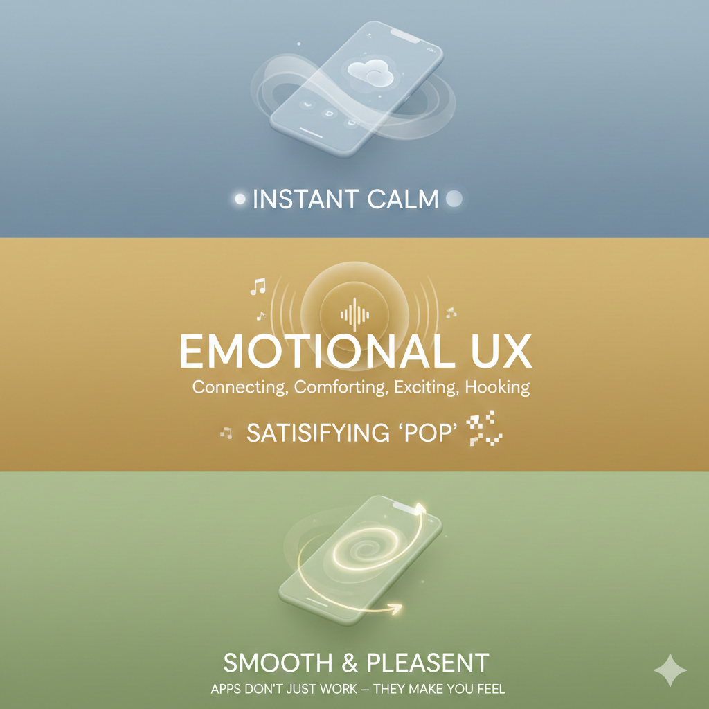
Apps Don’t Just Work — They Make You Feel
Ever opened an app and instantly felt calm?
Or clicked a button and heard a tiny “pop” sound that made you weirdly satisfied?
Or watched a smooth animation and thought, “Okay wow, this feels nice”?
That’s not an accident. That’s Emotional UX — the secret language of design that communicates directly with your feelings, not your brain.
Today’s digital world isn’t just about building apps that function. It’s about building apps that connect, comfort, excite, and sometimes… hook you.
Welcome to the world where user experience meets human emotion — silently.
The Hidden Power of Emotional Design
Every color you see, sound you hear, button you click, and animation you experience carries an emotion. Designers intentionally craft these micro-details to influence how you feel during every tap, swipe, or scroll.
Some examples:
Blue = trust, calm
Yellow = energy, optimism
Rounded buttons = friendly
Sharp edges = bold, strong
Apps don’t tell you how to feel. They make you feel.
Colors: The First Emotional Cue
Your eyes respond to colors faster than your mind can think.
That’s why:
WhatsApp uses green → safety + connection
Facebook uses blue → reliability
Netflix uses black + red → drama + intensity
A color palette can make you love an app before you even know why. This is the psychology of aesthetics — emotional UX’s first superpower.
Micro-Interactions: The Small Things You Never Notice
Ever liked a photo on Instagram and watched the heart pulse for a split second?
Or watched the “refresh” animation spin on TikTok?
Those tiny movements are called micro-interactions — and they do more emotional work than you think.
They:
★Reward you
★Satisfy your brain
★Reduce frustration
★Make apps feel alive
They turn basic actions into dopamine hits.
Typography: Your Emotions, But in Letters
Fonts have personalities. Look at the difference:
Bold fonts = confidence
Thin fonts = elegance
Rounded fonts = friendly vibe
All caps = urgency
Notice how Spotify uses smooth, rounded typography — easy on the eyes, easy on the mood.
Typography doesn’t just show words.
It sets the emotional tone of an app.
Animations: Emotion in Motion
Animation is the heartbeat of emotional UX. It's how an app speaks without talking. Soft animations calm you. Fast animations energize you. Bouncy animations make you feel playful. Take Apple’s interface:
Every animation is slow, smooth, and silky. It creates a premium, peaceful experience — like tech meditation.
Sounds: The Invisible Emotion Triggers
You know that “ding” when a message arrives?
Or the subtle swoosh when you send an email?
Sound design adds an emotional layer to your digital experience. Good UI sound:
★feels warm
★builds habit
★creates confidence when you complete actions
Apps literally sound like feelings.
Emotional UX = Higher Engagement
Here’s the truth:
Users don’t stay for features. They stay for feelings.
When an app feels:
★comforting
★easy
★satisfying
★ smooth
★relatable
…users come back.
Every. Single. Day.
This is why emotional UX increases:
★retention
★loyalty
★trust
★brand connection
It turns casual users into daily users — silently.
The Future of Digital Design Is Emotional
We’re moving into a world where apps don’t just solve problems — they shape emotions.
Emotional UX blends:
★psychology
★aesthetics
★behavior science
★design
★storytelling
It’s where technology becomes human. In the next decade, the best apps won’t be those filled with the most features… but the ones that make us feel the most understood.
Mehnaz Binte Ali Nasa
Intern
Content Writing Department
Comments (0)
Leave a Comment